Problem
There is a lot of inequality in healthcare. Particularly in health research, there is little diversity in the type of people who volunteer for clinical trials, which translates to medications and devices that do not serve people from all backgrounds and abilities.
Strategy
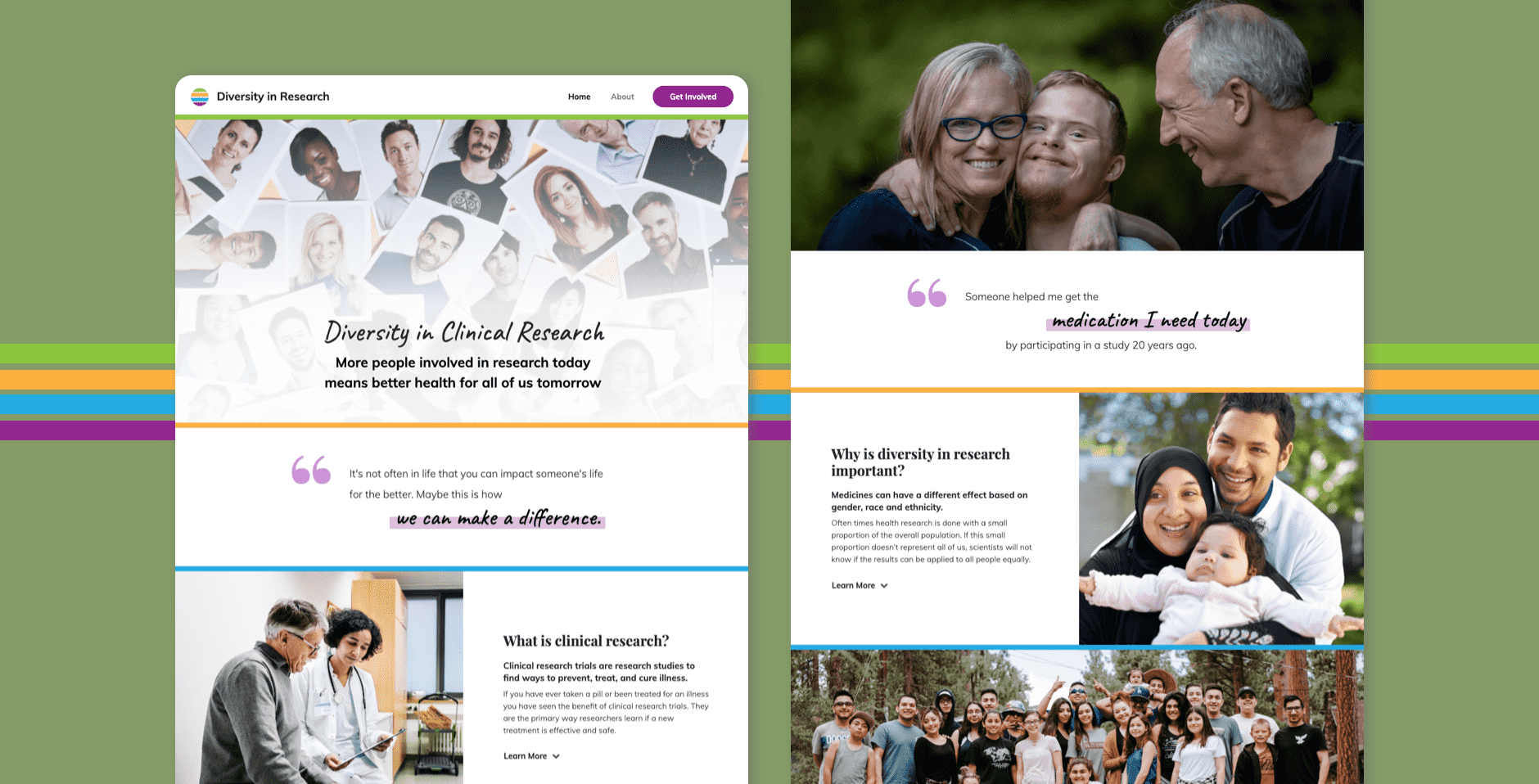
In order to encourage more diverse audiences to participate in health research, the Participant Recruitment team at the Michigan Institute for Clinical and Health Research (MICHR) put together a physical and digital strategy to reach the local community.
This landing page was part of the digital strategy that would be used alongside a participant recruitment project called the No Med Pharmacy, inspired by the MT Pharmacy.
This "pharmacy" was presented as an in-person booth event that featured pharmacy shelves with no medicine, demonstrating what would happen if no people were to participate in research studies. This page would accompany the booth as the follow-up for people who became interested in learning more and getting involved after the event.
Design Considerations
The design needed to be warm and welcoming, yet official. It also needed to emphasize diversity to reflect the need of diverse participants in the research process.
As I researched existing resources, I found sites that emphasized the importance of diversity in clinical trials, but many of them were a single page on a much larger university or research organization site. This made it so it was hard to find and did not appeal visually to the user. This site would be focused solely on the topic of diversity in clinical research and aim to provide a better, less confusing viewing experience.
Also, other sites were based in different geographic areas. We wanted to build a site that is focused locally, linking people directly to the University of Michigan website where they can learn more and sign up for clinical research studies near them.
I created two variations of a design. The final site used elements from both variations.
Design Iterations


Development
I used Bootstrap as a web framework for implementing the design, applying custom styles and JavaScript to bring the site to life.
Implementation Complexities
- Formatting the layout of the pull quotes
I heavily utilized bootstrap’s grid feature to align all the sections of my pull quotes in a visually pleasing way. The difficulty with this approach came with the modifications I had to make due to a responsive screen. I realized that the line wrapping wasn’t very satisfactory in the xs screen mode, so I iterated over different versions of formatting the layout for all screen sizes until I landed on a certain grid pattern for xs – s screens, and another one for md screens and larger. - Implementing the text underline
I modified the html "mark" highlighting tag to create the text underline effect. By turning the mark into an inline-block display style, I was able to change the line-height so that it did not take up the full height of the text. However, I stumbled onto problems on smaller screens. I found that the line-height set to 0 made it that when the line was too long on a smaller screen, the text repeated back upon itself! (Which, of course, is exactly what the line-height indicates.) So, I settled for the notion that the text underline effect would only be implemented on medium screens or larger. On smaller screens, the text would be the generic highlight. - Making the accordion chevrons change from down to up on click
I implemented a Bootstrap accordion feature to hide and reveal the “Learn More” content. When I first implemented the font-awesome icons, I originally had the chevron-down visible no matter what, even if the accordion had been fully expanded. I did not think this was a good experience, so I learned how to use the aria-expanded tags to show and hide the up and down chevrons when appropriate. - Adding scroll animations
I wanted the pull quotes to get extra visual attention, so I wanted them to animate upon scrolling. I played with many forms of animation from many different libraries, but landed on using the Animate on Scroll (AOS) library due to its simplicity and ease of implementation. By adding the CDN sources and using the built-in calls, I was able to easily add and modify the animation effects for the pull quotes. - Implementing a sticky header
I wanted to create a header that would stick to the top of the page, no matter where on the page the user was looking. I implemented this feature through the .sticky class, and ran into a couple problems. The first problem was that making the header have position of fixed meant it sat on top of all of my content, covering up the initial images. To solve for this, I put a margin-top value on my first piece of content that was the same height as my sticky header. That way all the content would fall below. The second problem I encountered once I added the scroll animations was that the animated text lay on top of the header, on the z-axis. To solve for this, I added z-index:2 and it ensured that the header would always remain on top.
Final Product
See a demo of the final site below, or in a separate tab.
Conclusions
This project gave me deeper exposure to web development, and I gained a deeper appreciation for how to implement grids to control the visual design of a project. I also learned more about coding libraries and how to use a CDN reference to take advantage of code that has already been written to enhance my own project.

